When bad covers happen to good books
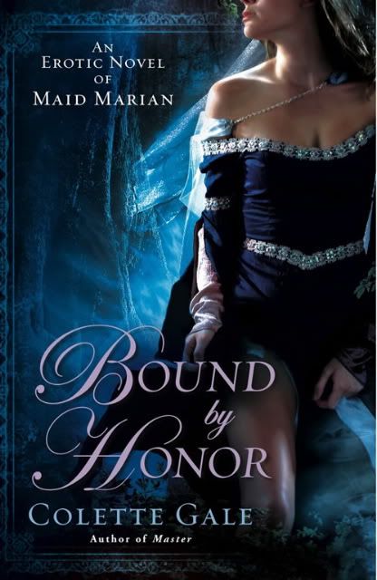
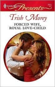
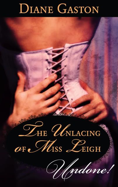
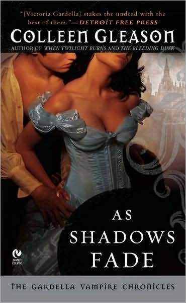
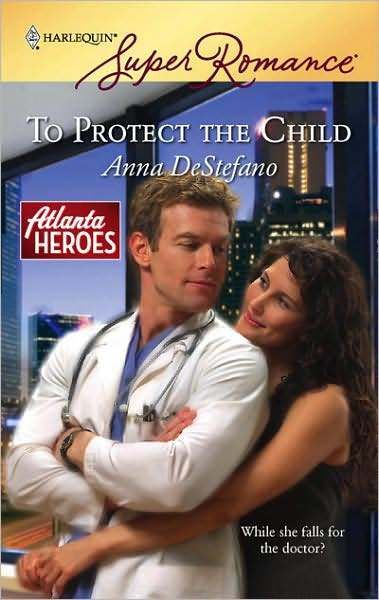
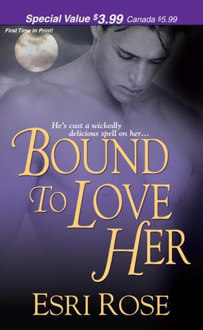
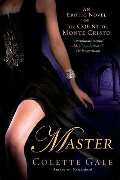
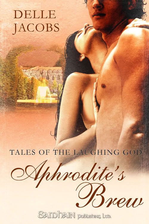
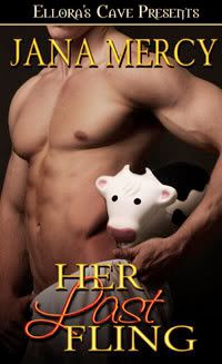
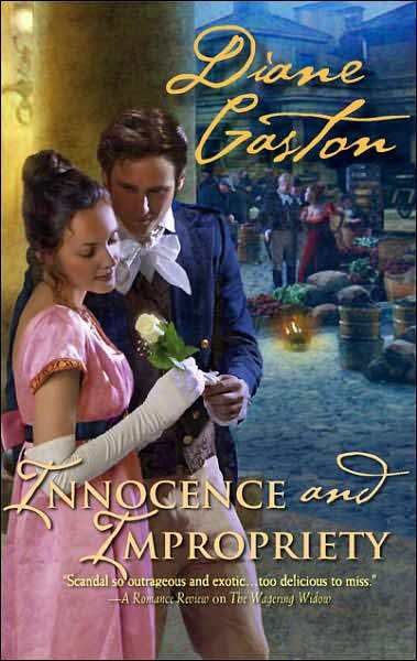
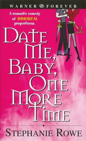
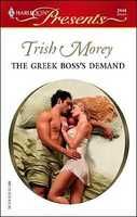
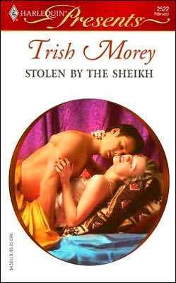
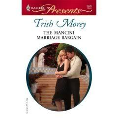
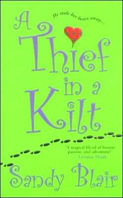
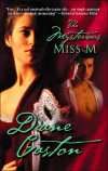
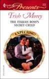
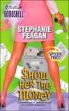
 Romance comes in for more of its fair share of hideous covers--too many acres of gleaming, waxed mantitty, historically inappropriate clothing falling off its owners, contortionist embraces, and so on.
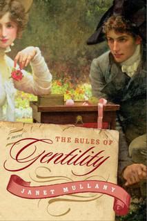
 If you're at the bottom of the publishing ladder, you don't have much influence over cover art (and even the big names don't get a whole lot of say in the matter). You may be asked for cover art ideas, which may or may not be used. I sent the designers of the English edition of The Rules of Gentility (Oct., 2008) a picture of Regency era bonnets--they used one in the design and I love this cover! Let's hope you love your cover, too, because generally what you see is what you get. Remember that changing a cover involves a whole time-consuming process which in such a deadline-driven business is done only in the most dire of circumstances.
Prepare to suck it up.
 The very worst thing you can do is go public. Cry at home and to your best friends, not to the online world. Find something nice to say about the cover ("I love the font treatment!").
However, if your cover and back cover blurb really misrepresent what your book is about, and/or is being marketed as the wrong subgenre, you do have a problem. Some review sites/publications have very little flexibility; the reviewer will give you a review based on what they're told the book is, not what it actually is.
 So, what do you do?
Damage control time. You don't want readers to pick up your book expecting one thing from the cover, and then getting upset when they discover they've put out good money for something they hate. You can't talk about it in public, but your friends can.
And if you're lucky--and send a discreet, nudging e-mail--a high visibility blog may pick up the story. I tell you, you can't buy publicity like that.
 You can also mail to bookstores telling them what the book is really about--Borders (at their national headquarters) has a romance booksellers experts list, and the wonderful Pat Rouse offers an amazing subscription service of mailing labels for bookstores and reader groups, updated quarterly, with information on what, and how many, bookmarks etc. to send.
However, and I must say there's nothing like the publishing business for keeping you humble--many people may love your cover. See, the marketing departments do have some idea of what they're doing, and you may have a "good" cover--even if it's the wrong one for your book. So all you can do is lie back, think of your royalty statement, and hope that your readers will still respect you in the morning.
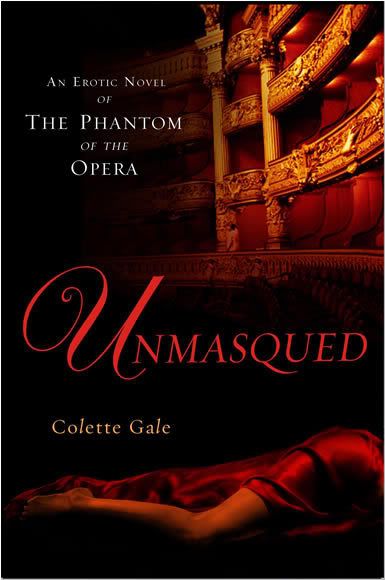
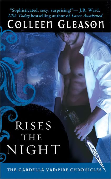
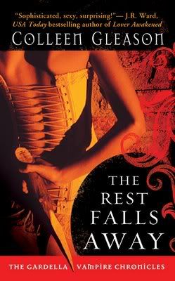
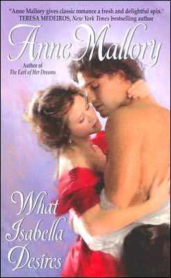
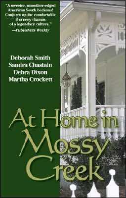
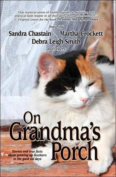
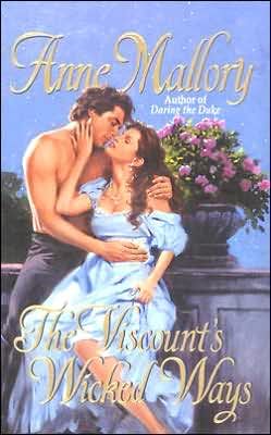
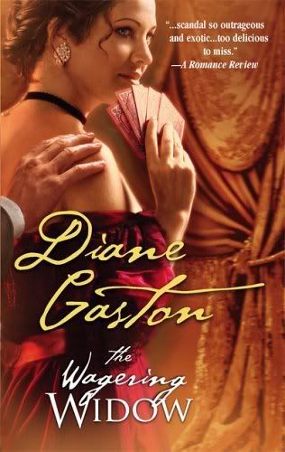
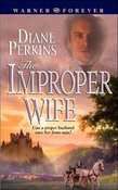
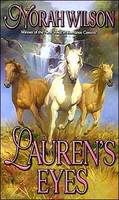
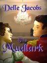
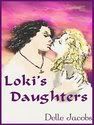
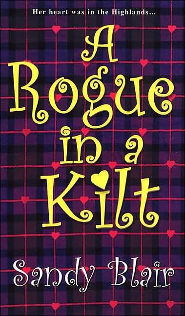
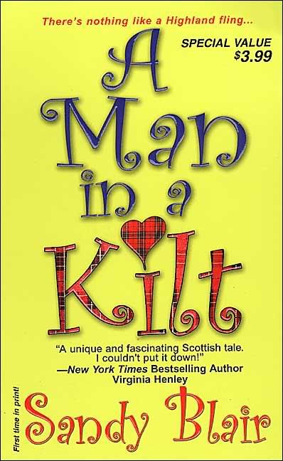
About the illustrations--regrettably, they are all real except for the top Jane Eyre, which was a finalist in a contest sponsored by Slate.com of illustrating the classics in pulp style. The whole gallery of hilarity can be viewed here. And here are some very odd books that probably got the covers they deserved:

Labels: Covers, damage control
posted by Janet Mullany @ 4:41 AM
![]()
![]()


13 Comments:
I had to laugh at this post! I have seen some AWFUL covers that hid some wonderful books. And I have commiserated with some of my newly published friends on some covers that literally made them cry.
However, some covers are really works of art. I have an original painting of one of Stephanie Laurens's covers. It is one of three in existence by the actual cover artist. It was part of my prize package for winning Chapter Three of Avon's FanLit Event. I met Ms. Laurens at a book signing in Bimingham, Alabama and she told me about the rarity of my painting. She has one, I have one and the artist has one. How cool is that? It hangs over the fireplace in my writing studio as inspiration. I think historical romances have fewer clunker covers than other genres. What do you think?
You said that if you get a cover that misrepresents you, you can't talk about it, but your friends can. Why can't you talk about it? Wouldn't they want to know if you're getting feedback that says people are buying it expecting one thing, and then getting another? It's a business relationship, after all. I would think that if you spoke about it in a professional way, it's all part of doing business.
Louise, lucky you to have that painting! I think historicals are blessed with many clunker covers.
Esri, I'm not sure that I believe in the "offend your editor and you'll never publish in this town again" theory, although Jane L was given a flat rejection on her option book (but then everyone else rejected it too!). I also wonder exactly how "big" a writer you have to be to make a stink about an inappropriate cover.
It's probably better to play safe. As I said, it's a humbling business.
However, what you can do is to collect online comments and forward them onto your editor--something you'd do as a matter of course-- and I think it gives you some clout when the next contract is offered--presuming there is one.
Janet: Thanks for the clarification. There were a couple of reviewers who said they felt the cover was misleading, and I thought I'd send those along.
And I forgot to say that I really like that British cover for Rules. Although I still love the American one, too.
Louisa: I don't know if historical have fewer clunker or if we're used to the clunkers they do have. I'm always biased in favor of a pretty dress, so they have that. :D
I remember hearing about a cover where the hero or heroine had three arms! But I can see how goofs like that can be turned around to the author's benefit--people will want to see those sorts of covers and laugh with the author.
I'm with Esri. I like the U.S. cover for Rules, too.
Here's a question for everyone. What are some differences you see between U.S. and British covers?
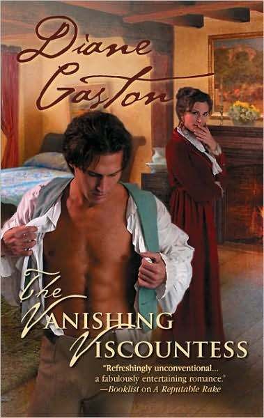
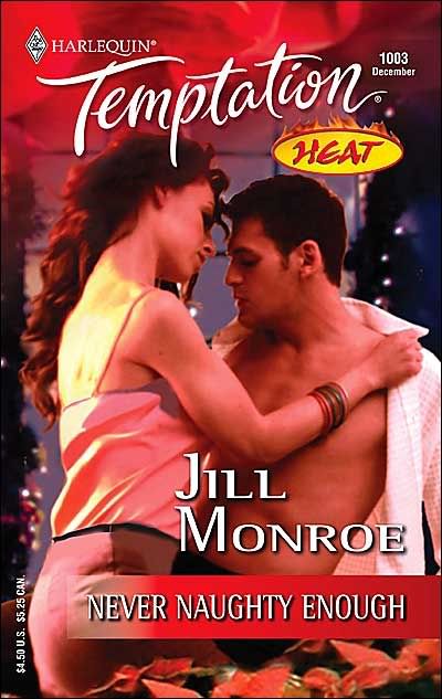
Janet said: Romance comes in for more of its fair share of hideous covers--too many acres of gleaming, waxed mantitty, historically inappropriate clothing falling off its owners...
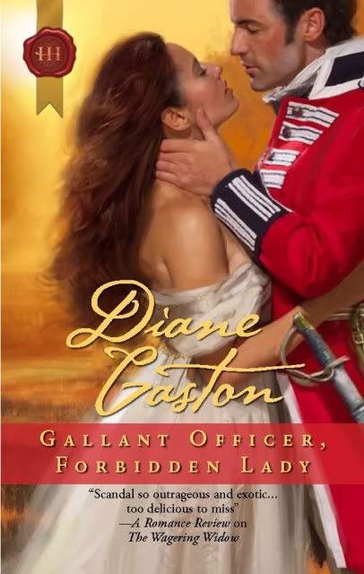
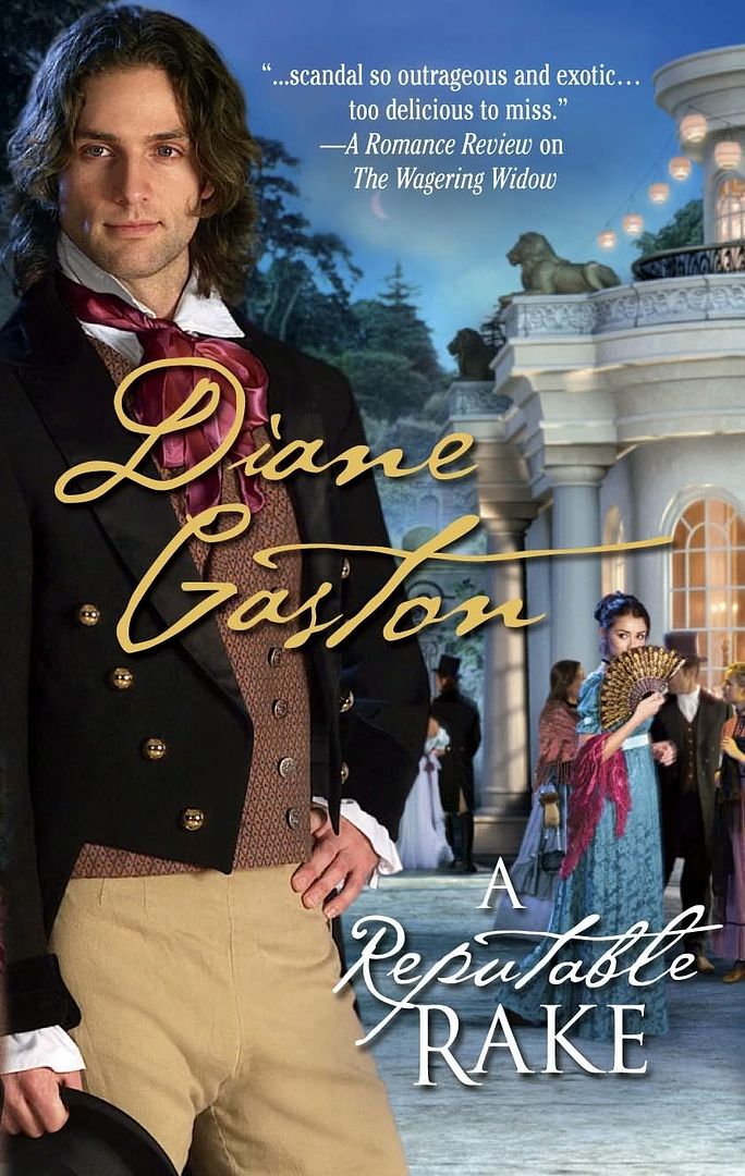
Hey, this describes the cover of The Vanishing Viscountess and I LOVE that cover.
You do mention that many people might love a cover the author hates. I've learned to appreciate the marketing appeal of the "clinch cover" and "mantitty" certainly doesn't bother me if it's done like on VV. But I totally understand why some authors would dislike such covers.
Because this is a business and the relationship with the publisher is a business relationship, I totally agree with you that it is not a good idea to make one's gripes public!
Suzanne Brockmann has a great story about one of her covers, when they made her absolutely gorgeous hero look more like the Pillsbury Dough Boy.
I just got the cover for my December release. I had mixed feelings about it, but with this publisher, there's not a lot the author can do. They did take my cover request sheet seriously, but I didn't know how specific it had to be. And I thought the artist was supposed to touch base with me first, according to what my editor said, but apparently not. What do you think?
Terry,
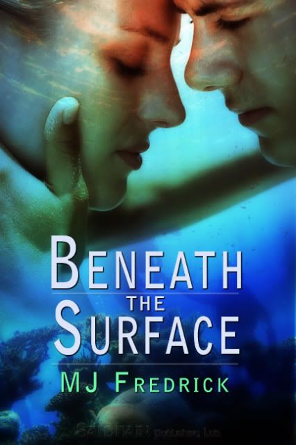
I might have preferred something showing the hunky hero, but the cover is vivid and exciting. I don't see a big problem with it.
Thanks, Diane - My first thought when I saw the cover was "BLUE". But it depicts a scene from the book, which is good. A little more of the h/h might have said 'romance' a bit better, but then, if the book's in the right shelf in the library, the reader ought to have that much figured out. And it certainly does say 'action adventure.'
If you get a truly ghastly cover, you might be able to get away with talking about it in public—if you can keep a sense of humor about it. Witness Christina Dodd's infamous three-armed woman. See it (and read Chrstina's humorous take) at:
http://www.christinadodd.com/castles.php
Fortunately, I've never had a bad cover (though one of my ladies had a severe case of heroine hair). And the one for my upcoming book is wonderful, and painted by the amazing Tony Mauro. I just got the cover flat and it's even more amazing in person.
Lisa, I love Christina Dodd's three-armed woman cover story--if only we had more like that!
The three-armed heroine was a Christina Dodd cover. It became such a wild phenomenon that I think she actually cherishes it now. I know of a few covers that had certain shadows that looked obscene. One author distributed stickers for bookstore owners to discreetly stick on the cover.
I vote for sucking it up when you have a bad cover, although a mis-representative cover really needs to be explained to the buyers.
I've had my share of awful covers, and they were my design- just more so. Colors so intense they felt like they were assaultive. Who needs orange faces and green hair? Changing print publishers became a must for me even though I was perfectly happy with their e-versions, especially their distribution.
But now I've been doing covers for a print publisher who will probably do the print version of Lady Wicked, thus allowing me to have the e-version out by my first e-publisher.
I'm not sure which is worse, something ridiculous, something mis-representative, or something just plain ugly. I know people who had planned to buy a book but then put it back down because the cover repulsed them.
In my new video, one person thought the hero is awful. I have to say he's not my favorite, but he's the one who was put on the cover, so I pretty much had to go with it. And I don't think he's awful, just not my favorite. But most people seem to love it, and it's at the point of going viral now, having about 700 hits in 1 1/2 days. So Ill take it.
Post a Comment
<< Home
Subscribe to Post Comments [Atom]