Spring DIY—How Not to Decorate
by Lee McKenzieLast week I was looking for something on the bookshelf in our family room and came across The Practical Encyclopedia of Good Decorating and Home Improvement. The book is part of a multi-volume set. We have Volume 1—A to Ame, but none of the rest of the set, and I have no idea where it came from. The inside front cover is inscribed with W. N. Watson, March 3, 1970, which is also the year the book was published, but we don’t know anyone named Watson.
My house is always up for a little improvement and good decorating, so I opened the book and took a look. Fifteen minutes and more than a few belly laughs later, I decided this was too much fun not to share.
Since the book was published in 19070, I’m guessing most of the photographs were taken of homes that were decorated in the '60s.
I remember the ‘60s well, although I don’t remember them being this red.

The table and chairs are fabulous, in a breakfast-with-the-Jetsons kind of way, but this photo is not meant to be an example of good furniture choices. This kitchen, with it’s two red arches (the one on the right appears to be refrigerator), is in the section titled "Accessories and Accents—Flowers and Plants." According to the caption, "There’s really no need ever to do without some sort of table decoration when it’s so simple to compose one with the fruits so readily available in the grocery store."
Until I read that, I hadn’t even noticed the fruit bowl! I think I was too distracted by the gold wall, red arches and purple carpet.
While we're on the subject of red...
This photo is in the section titled "ABC’s of Decorating—Windows." Apparently "instead of unbalancing the room, the windows help round out the color scheme and become an integral part of the color scheme." When they say windows, they're actually referring to the red drapes and the red blinds.
And is it just me, or does color "scheme" imply more than one color, or at least more than one shade of a color?
The jar of cigarettes and the ashtray in the foreground caused one of those belly laughs I mentioned earlier. Times sure change, don’t they? I can’t imagine seeing those in a recently published decorating guide.
Okay, enough red. Let’s move on to green.
I find myself inexplicably captivated by this room. It's as though I’ve wandered onto the set of a Barry Manilow musical. This photo is categorized as "Accessories and Accents—Light fixtures and lighting effects." Once it was pointed out, I could see that the floor-level lighting and the top-lit black cube do add some interest. But once again I was distracted by the "color scheme," and all those containers of cigarettes and ashtrays. In case you can't see them, there are three of each. And then there's the chair that is oddly reminiscent of a toilet seat lid.
These days, the designers on TV decorating shows often say they want to add a "pop" or a "punch" of color to a room. Taken to it’s extreme, here’s what happens. The captions says: "Walls can do much more than stand there and be decorative..."
I love the built-ins and recessed lighting but if I was updating this room, the first thing I'd do is paint the wall to match the cabinets. Let the accessories do the popping. I love the red chair and ottoman, and the television made me laugh. Does anyone remember those pre-remote days when you actually had to get up and go across the room to change channels?
This dining room is in the "Accessories and Accents—Rugs" section. Yes, it’s all about that rug. Feeling crafty? According to the caption, it's made from a piece of indoor-outdoor carpet with fringe glued around the edge.
I really do love the simple, uncluttered lines of mid-century modern furniture, and I think this dining room table and cabinet could easily be brought from the last century into this one. Providing I got rid of the too-short gold drapes and the amber glass light fixture above the table. And the red-fringed green carpet would definitely have to go.
Saving the biggest belly laugh for last...
Speechless, aren't you?
Once again, it’s all about the rug, which "catches the eye and sets the theme."
Theme? The caption insists "The effect is one of harmony," but this poor guest room has been turned into a kaleidoscope! I think I’d have trouble falling asleep, fearing the headboard might fly open and I’d be trampled by a herd of animals.
I hope you’ve enjoyed this trip down memory lane as much as I did. And may I make one suggestion? If you plan to do a decorating DIY project this spring, you might look to something other than The Practical Encyclopedia of Good Decorating and Home Improvement for advice!
They say everything that goes around, comes around. Do you think that's true of '60s home decorating?
Until next time,
Lee
~~~~~
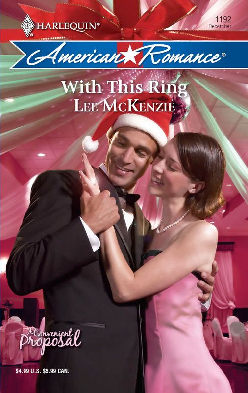
Lee McKenzie is not an interior designer. She writes lighthearted stories for Harlequin American Romance. Her second book, With This Ring is available as an eBook from eHarlequin.com and Amazon.com (Kindle edition). Her next two books (titles and publication dates TBA) are set in San Francisco, and the first book in the series was inspired by the '60s.
Tomorrow, Lee is being interviewed on the Harlequin American Romance Authors, and she'll be giving away an eBook copy of With This Ring. You’re also invited to visit her website and her personal blog, The Writer Side of Life.
Labels: Lee McKenzie, spring DIY
posted by Lee McKenzie @ 1:00 AM
36 comments
![]()
![]()